

x
Over the Summer break of 2015, end of Freshman year, I worked for LPK and their Pringles team, and designed new cans, graphics for meetings, concept sketches, did audits, and more. Below are a few of the items I'm allowed to show now (many of the other items are still confidential to the company)!
------------------------------------------------------------------------------------------------------------------------------------------
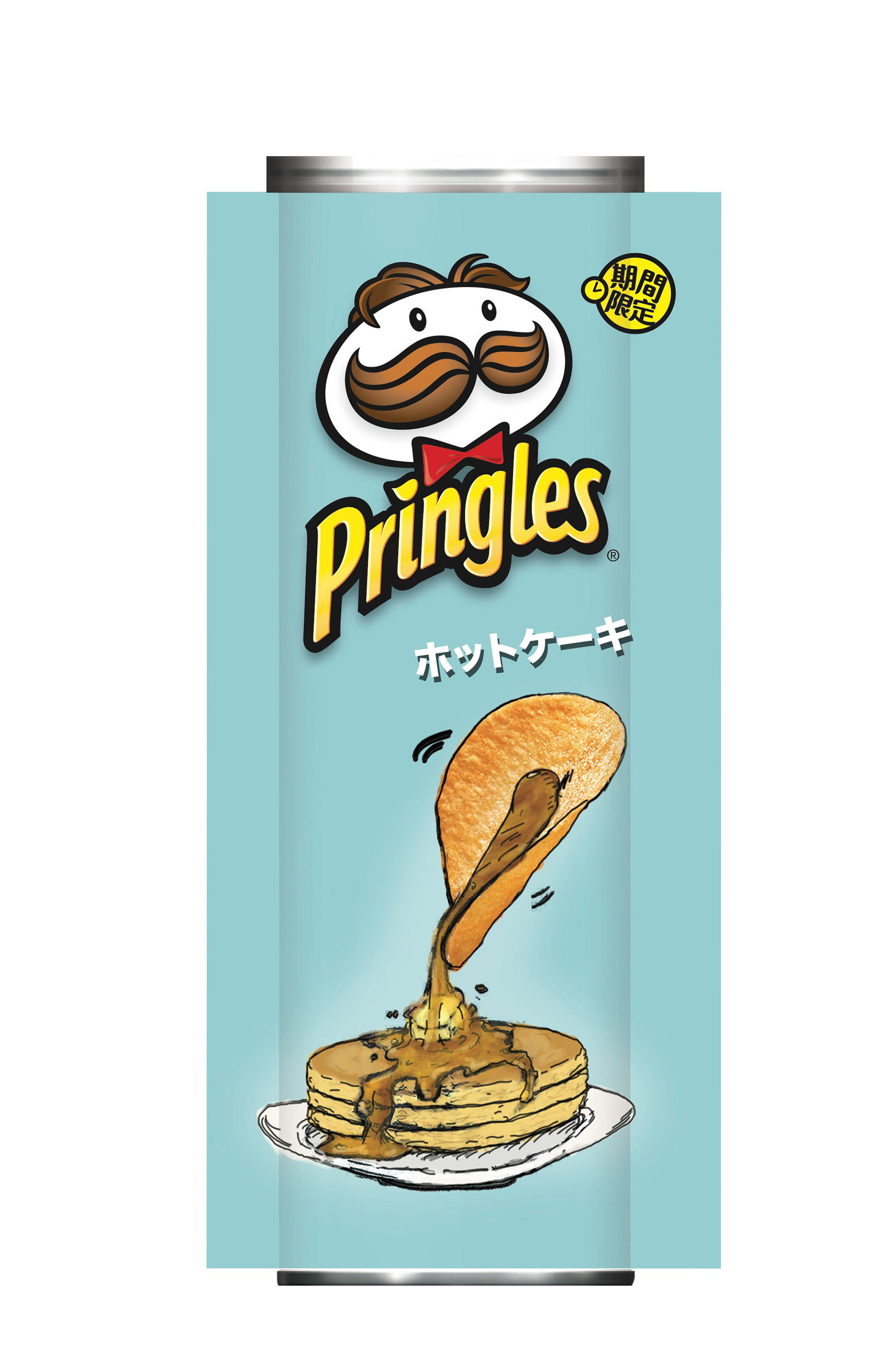
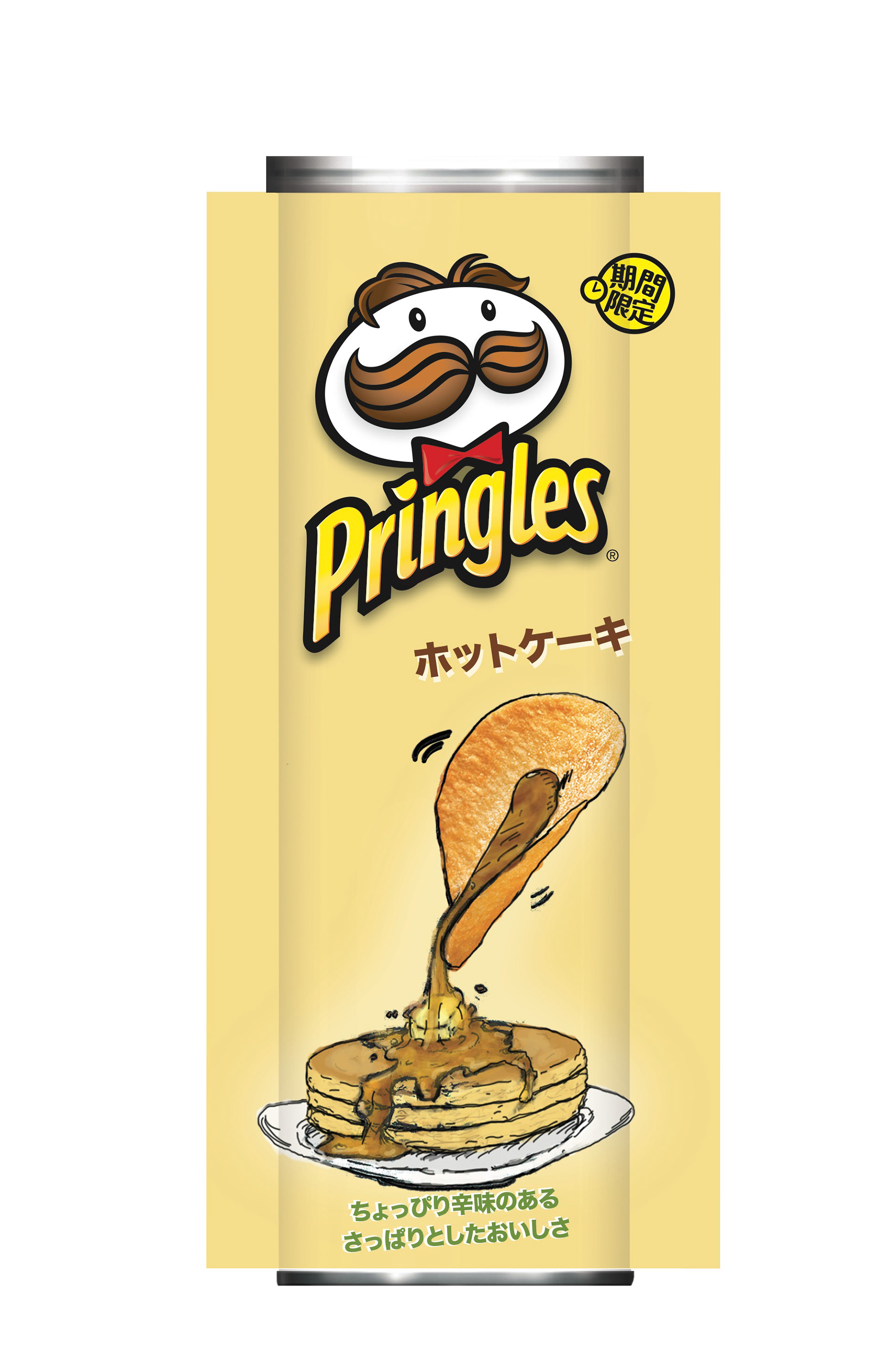
One project I was leading was the can design for a new limited-edition flavor of Pringles in Japan. The flavor was Pancakes. I did several concept sketches (as the cans need to have the chip interacting with the flavor as a story), including the following:

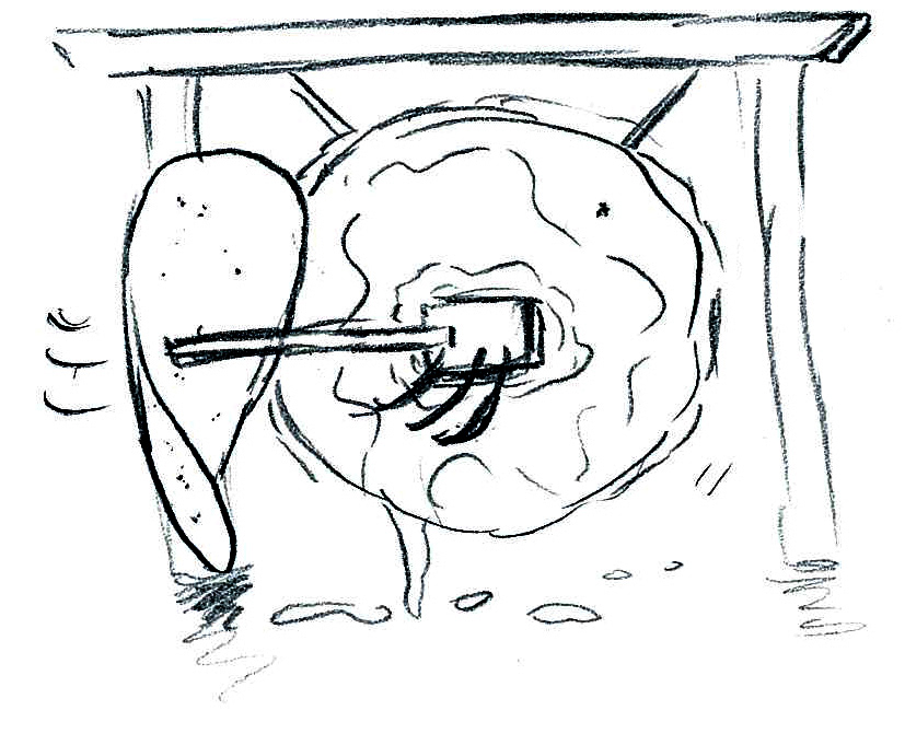
It was decided that the sketch that worked the best was when the chip was acting as the syrup dispenser, and the sketch was worked on changing the width of the pancakes (and other factors):


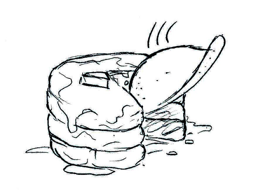
The draft design was then put on the can (with flavor text and the logo), and several colors were tried out using Pantone chips (below are three of the many):

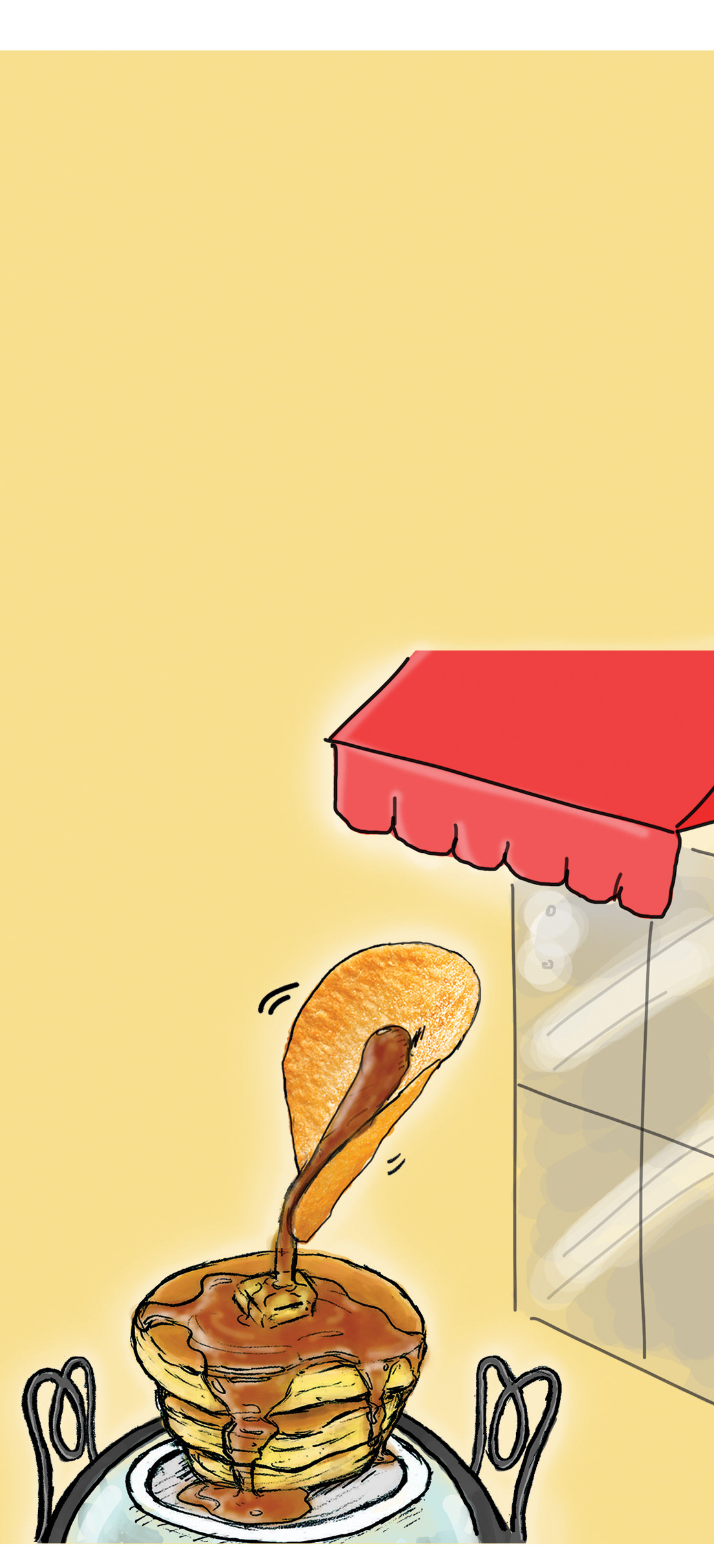
It was then decided that the story of the chip needed to be explored further with a backdrop. After compiling references, we chose to use the cafés that pancakes are sold in in Japan. This way, the flavor text could be placed on the frills. A napkin was placed for restaurant context, and the pancakes were changed to reflect pancake mix packaging in Japan (a more bird's eye view):

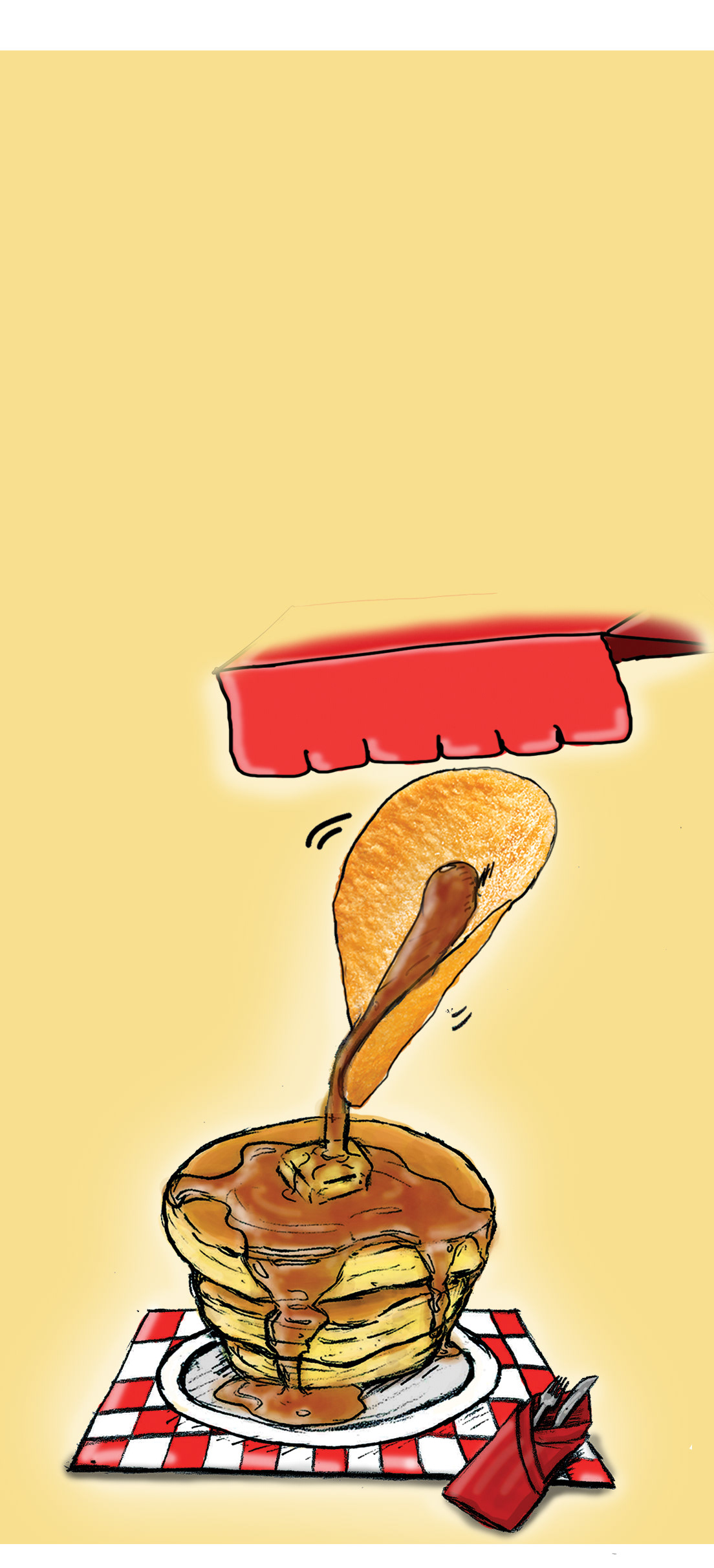
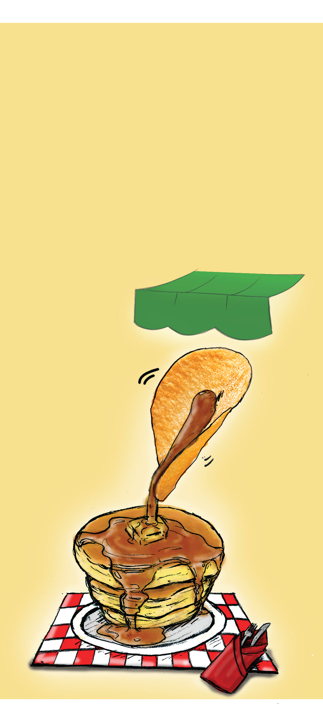

More background story was requested from Pringles clients, so a cafe table, chairs, and window was added:
The design was then released to a specialized illustrator. The release date of the flavor is currently unknown. I learned quite a bit about the design process in an agency, and about clients through this project!
------------------------------------------------------------------------------------------------------------------------------------------
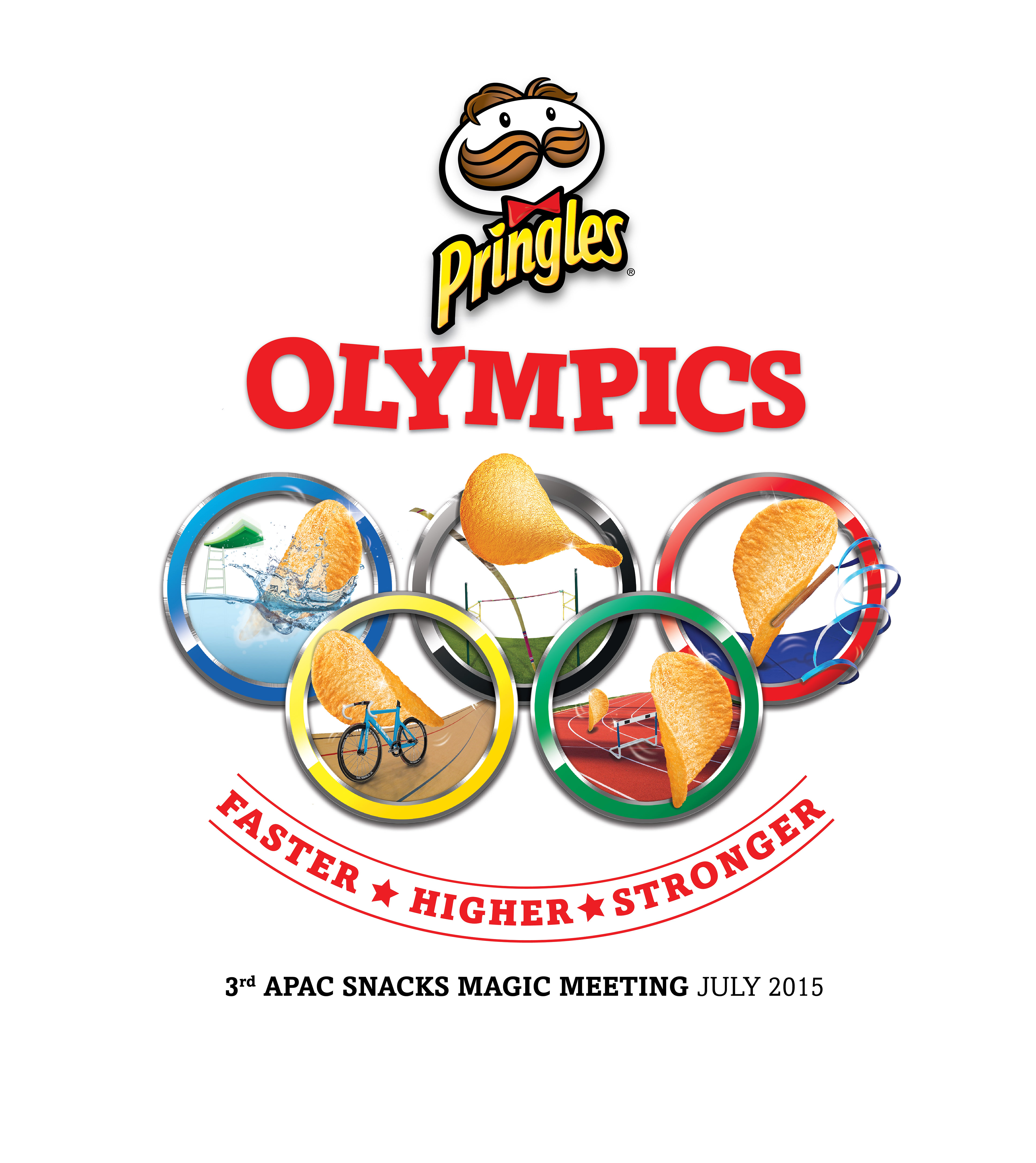
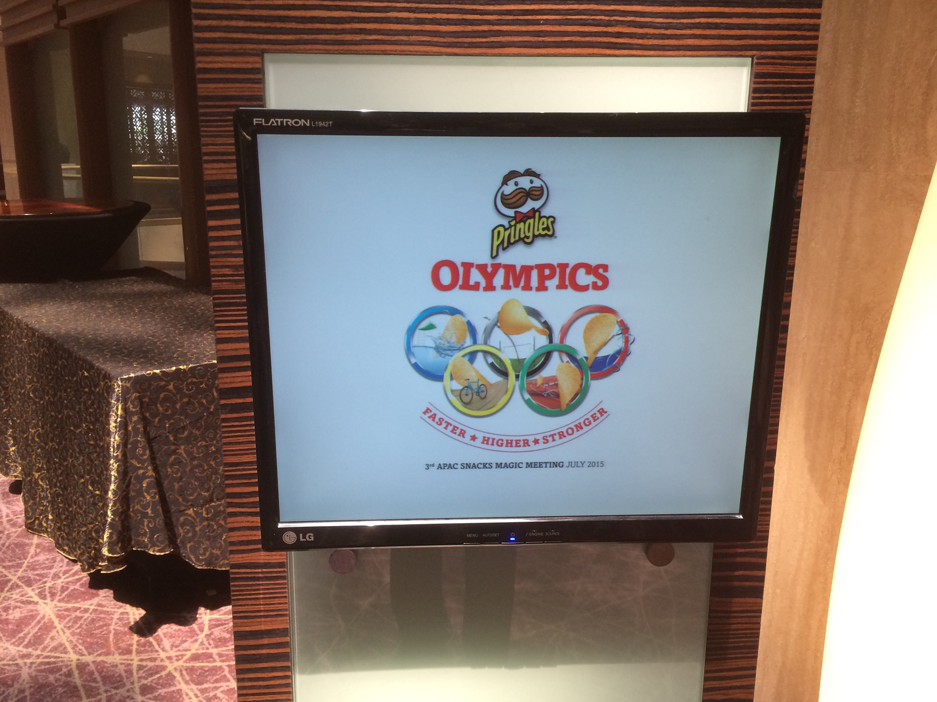
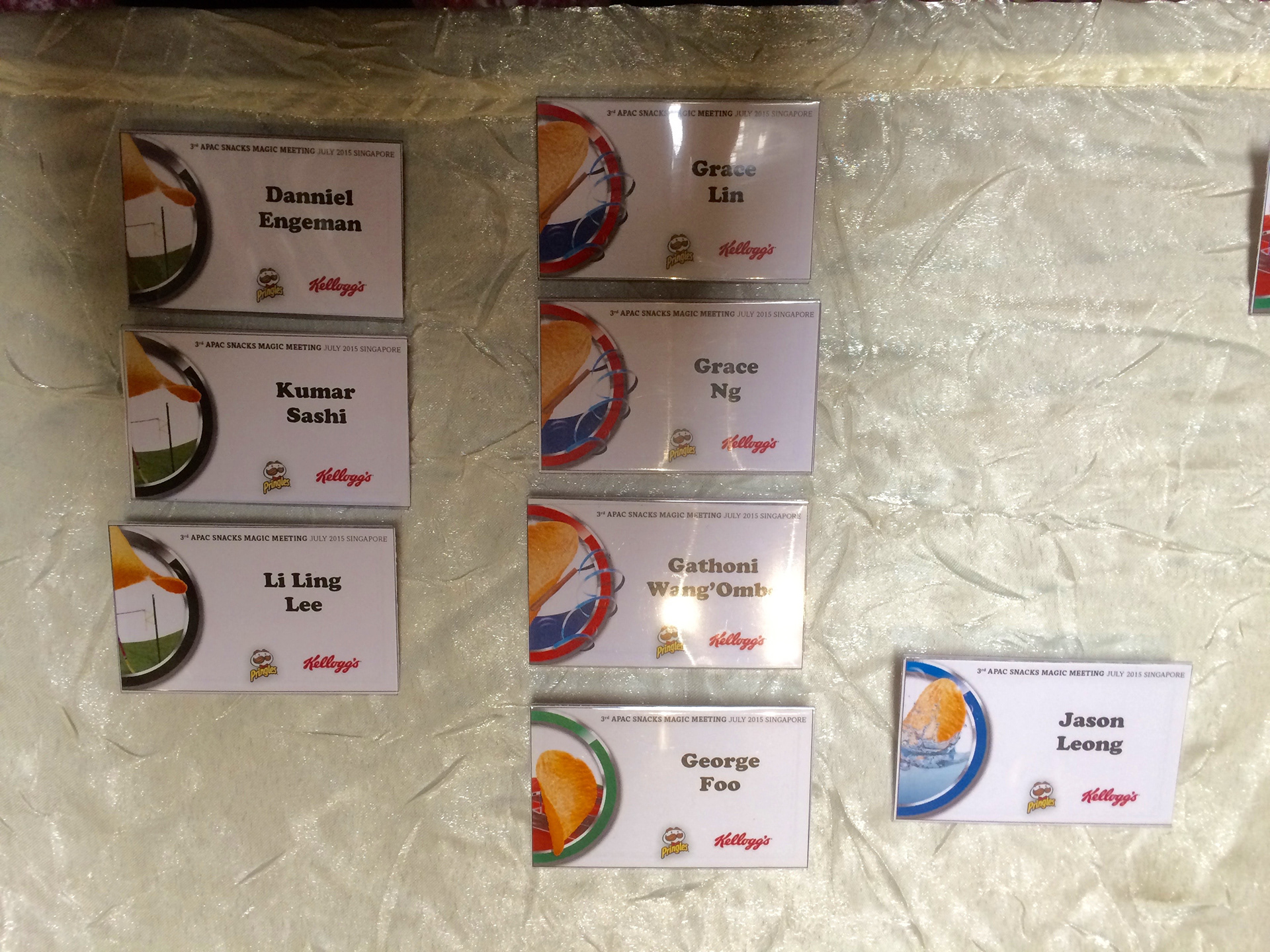
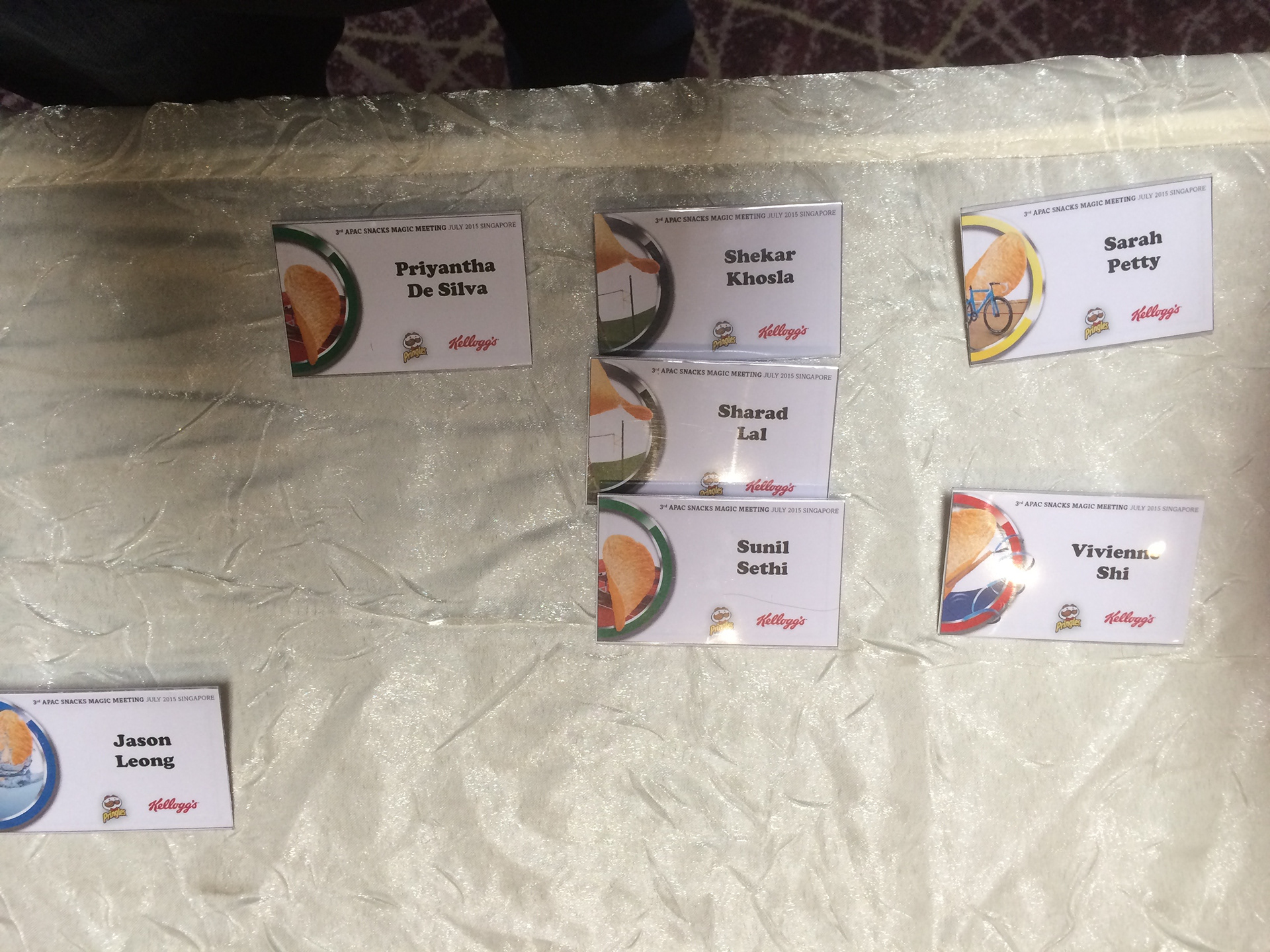
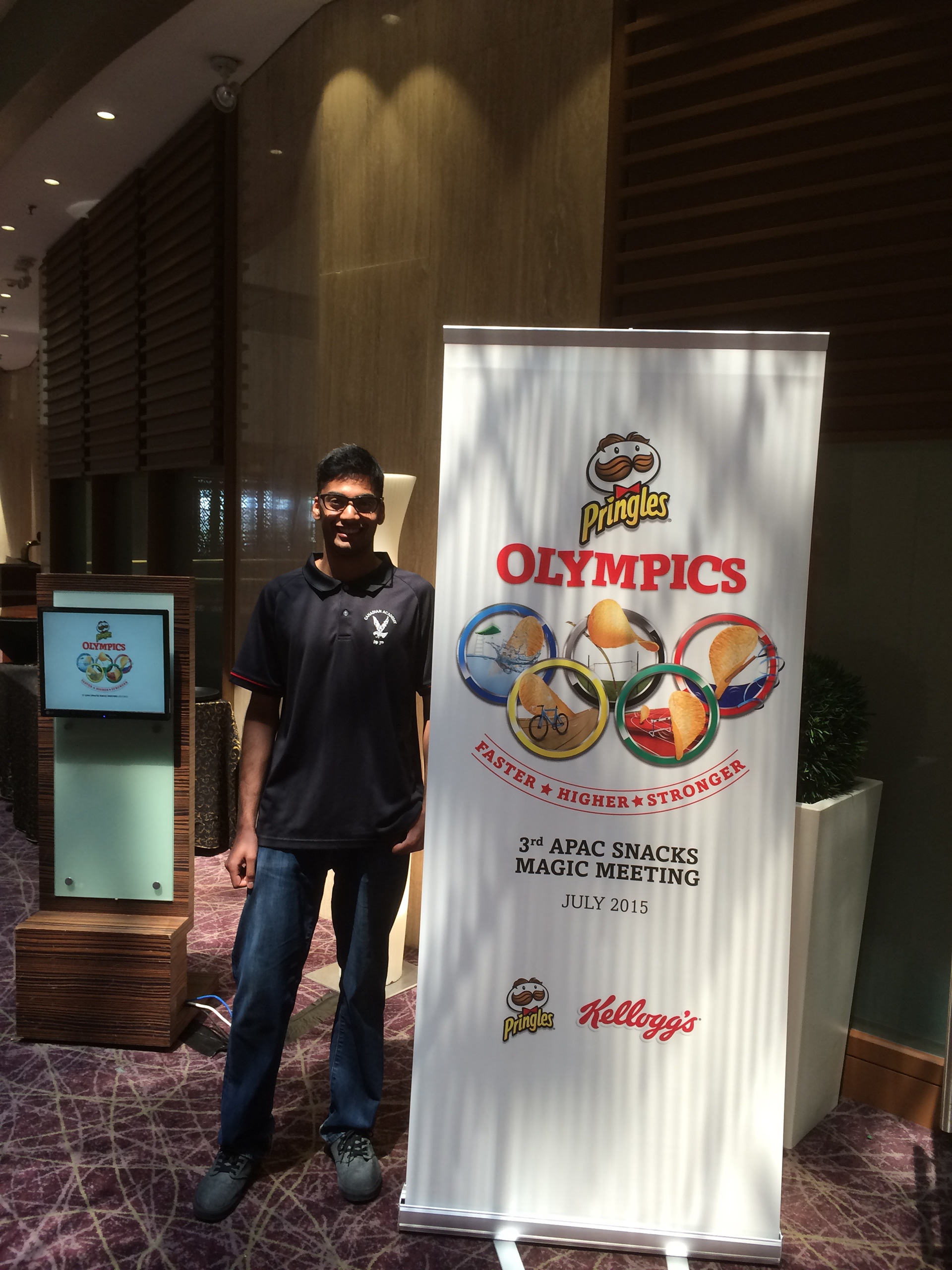
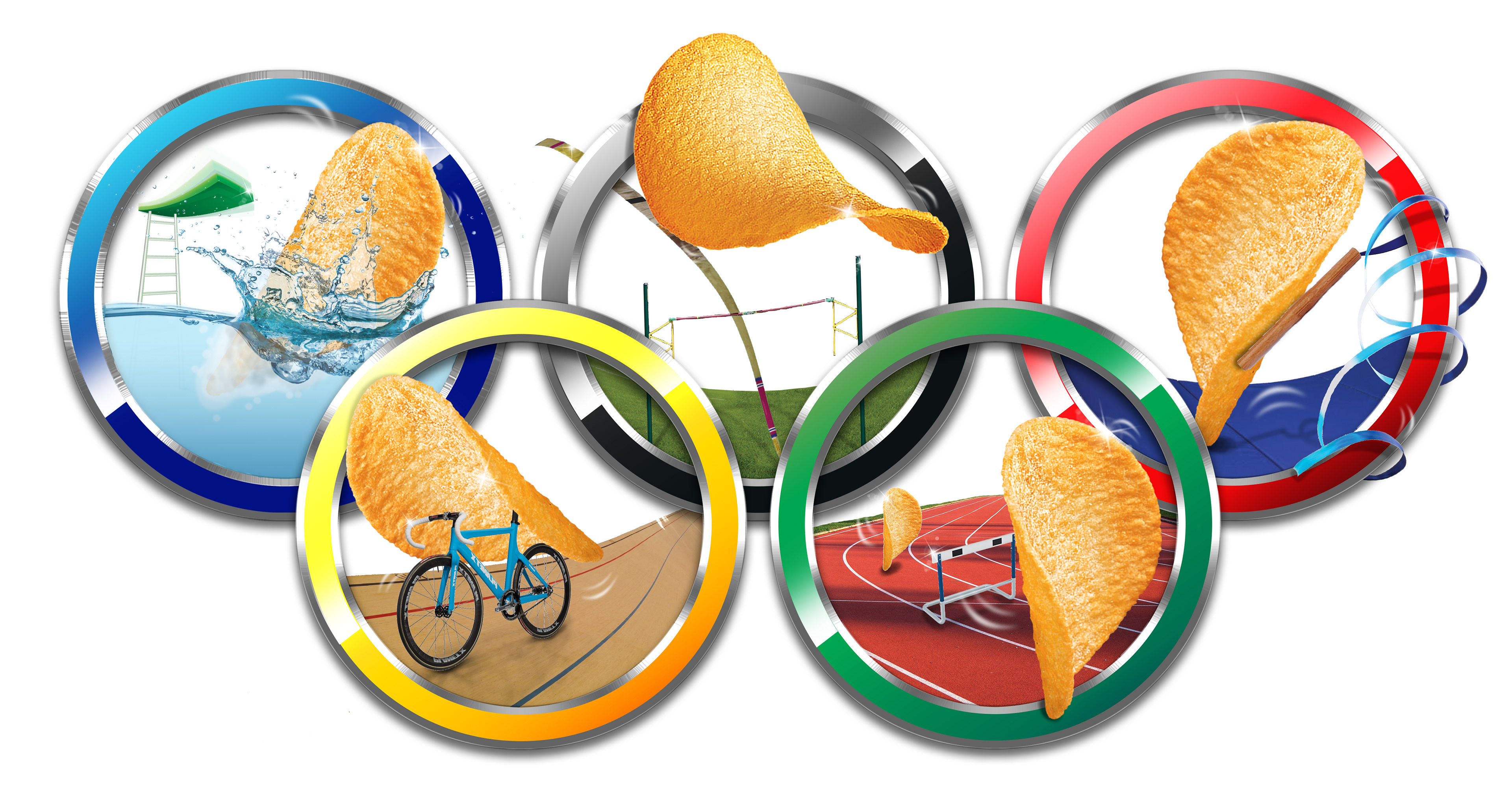
Another project I led was designing the graphics for an upcoming Asia-Pacific meeting Pringles (and Kellogg's) were hosting in Singapore. Taking draft sketches, I digitally illustrated the above graphic. The theme for the meeting was "Pringles Olympics", thus the chips competing in Olympic sports. Each ring required a solution for how the chip would interact with the sport, and how it could extend beyond the ring to give it life. After making the main graphic, I then applied it to physical and e-banners, name tags, and t-shirts:
The meeting was successful in showcasing the new Pringles and Kellogg's snack lines, and my graphics hopefully captured the fun and playfulness that Pringles embodies!
------------------------------------------------------------------------------------------------------------------------------------------
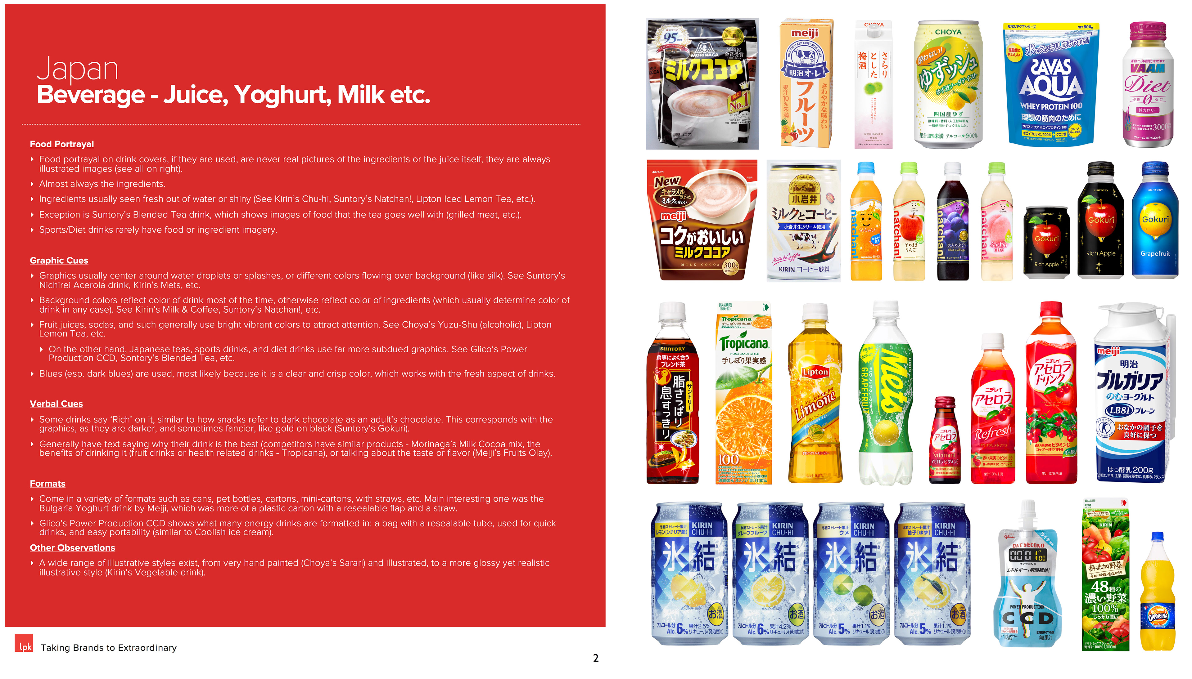
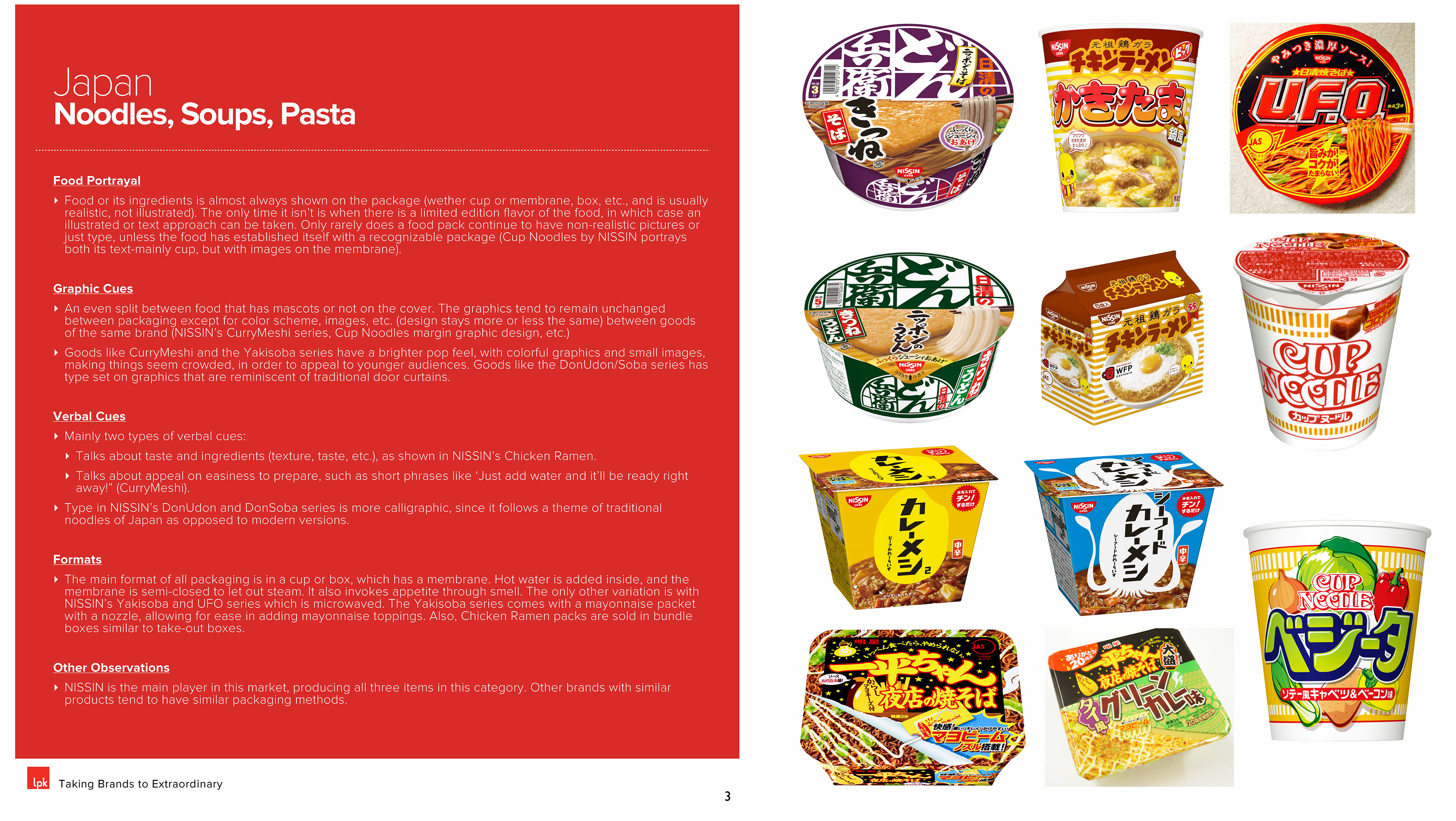
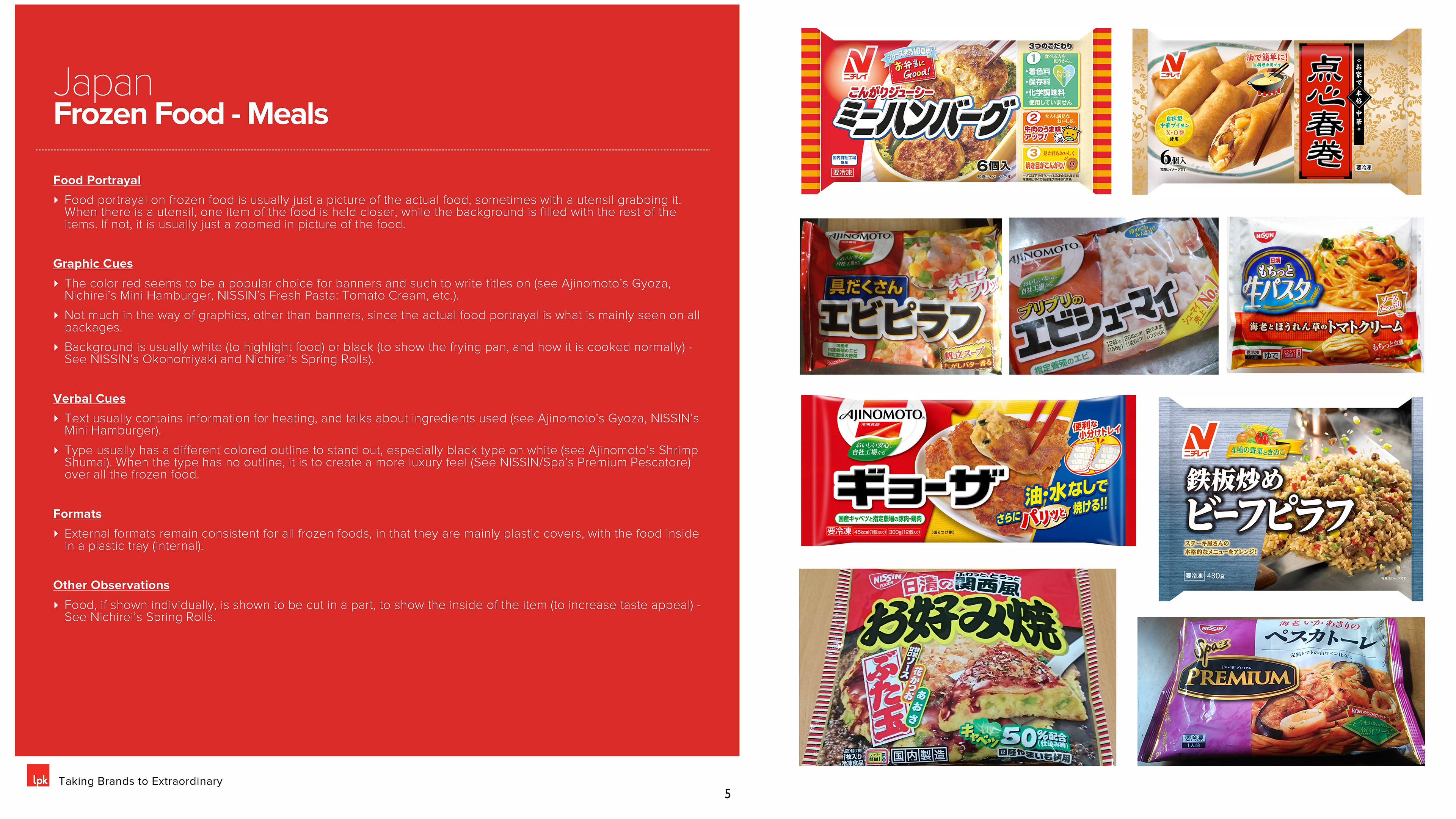
Something else I worked on was a market audit for Kellogg's. It was to help point in a new direction for Kellogg's packaging. I was one of the main contributors, researching the Japan market:

------------------------------------------------------------------------------------------------------------------------------------------
Big thanks to LPK (and Pringles) for providing me with this wonderful learning opportunity.
© LPK, Pringles, and Kellogg's, 2015. All rights reserved.